Smarter Color, Less Guesswork with color-mix()
Blend, tint, and shade colors directly in CSS—without breaking your palette
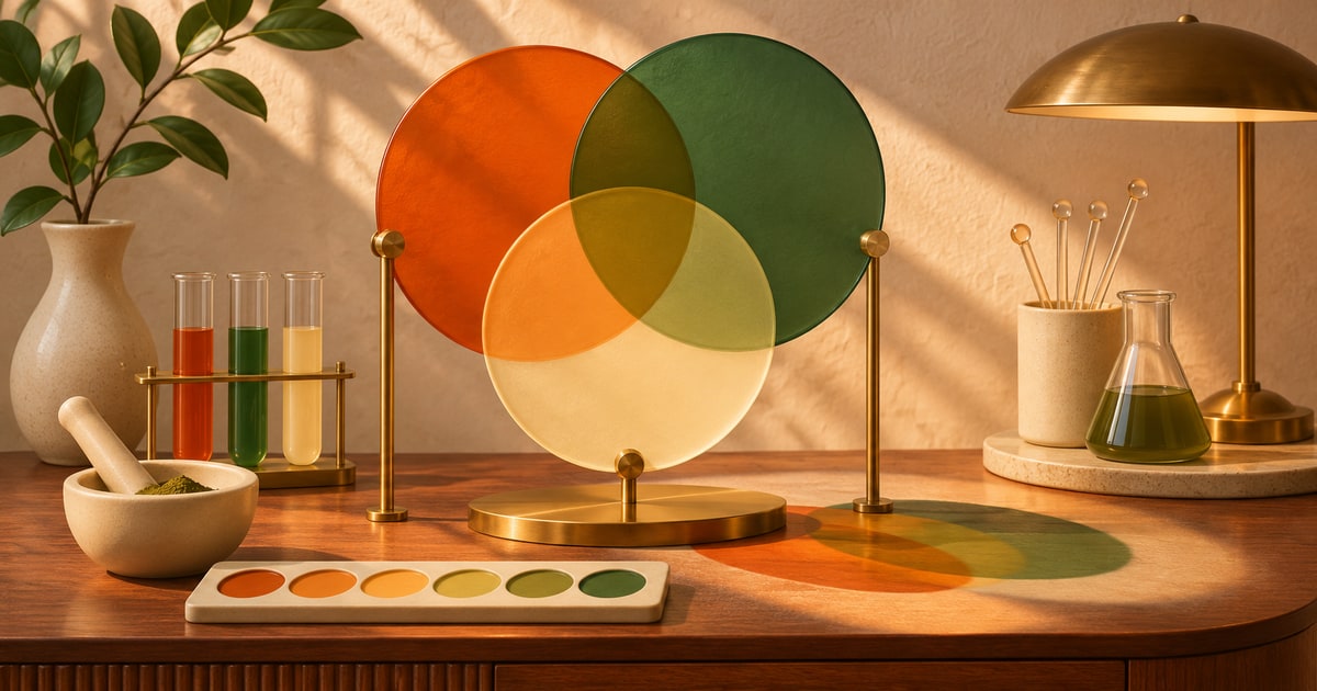
There’s a certain kind of CSS color work that starts out innocent and gets messy fast.
You’ve got a brand color. You need a softer version for a border, a darker version for hover, maybe a tinted background that still feels related without looking identical.
So you start guessing. A little lighter. A little more transparent. Maybe a totally different hex that “looks about right.”
color-mix() is what you reach for when you want those relationships to be intentional instead of improvised.
Why this has always been more annoying than it should be
Working with color in CSS has never been hard in the basic sense. If you know the exact color you want, you can write it.
The annoying part is everything in between.
Maybe you want a version of your accent color that is 20% softer. Maybe you want text that leans toward the background color instead of sitting on top of it too harshly. Maybe you want a hover state that clearly belongs to the same palette without feeling like you just guessed and hoped for the best.
For a long time, that usually meant one of two things: precomputing colors somewhere else, or manually inventing new ones until they felt right.
Neither is ideal. One slows down the workflow. The other turns your palette into a pile of “I think this was for the badge border?”
What color-mix() actually does
color-mix() lets you blend two colors together directly in CSS.
That means you can say, in plain terms, “give me mostly this color, with a little bit of that one mixed in.”
The result is a new computed color that still feels tied to the originals, which is exactly what makes this useful. You are not pulling random values out of the air anymore. You are defining a relationship.
That relationship can be subtle, dramatic, neutralizing, tinting, shading, or just enough to make a system feel cohesive instead of patched together.
The mental model (this is the part worth remembering)
color-mix(in <color-space>, <color-1> <percentage>, <color-2> <percentage>)Under the hood, the syntax is a little formal. In practice, the idea is simple: pick a color space, then tell the browser how much of one color and how much of another you want.
If that sounds abstract, think of it this way:
one color sets the direction, the other color nudges it
/* Mostly brand color, slightly pulled toward white */
background: color-mix(in oklab, var(--brand) 85%, white);

/* Brand color with some black mixed in for a darker state */
background: color-mix(in oklab, var(--brand) 80%, black);

/* A quieter border that still belongs to the palette */
border-color: color-mix(in oklab, var(--brand) 35%, canvas);
If you only remember one thing, remember this: color-mix() is less about inventing colors and more about deriving them on purpose.
Where this starts to feel genuinely useful
Softer surfaces that still feel connected
A common UI problem is needing a tinted background that clearly belongs to a component without screaming for attention.
.notice {
  background: color-mix(in oklab, var(--accent) 14%, white);
  border: 1px solid color-mix(in oklab, var(--accent) 40%, white);
}
This is the difference between “same family” and “same exact color everywhere.”
Hover states without guessing
Hover colors are one of those tiny things that get weird fast. Too dark and the component feels jumpy. Too light and nothing really changes.
.button {
  background: var(--brand);
}

.button:hover {
  background: color-mix(in oklab, var(--brand) 82%, black);
}
You are not hunting for a second hex value here. You are defining how the original should shift.
Text and borders that calm down a little
Sometimes the raw color is just too loud for secondary UI pieces. Mixing it toward the surrounding surface gives you a quieter version without losing the connection.
.tag {
  color: color-mix(in oklab, var(--brand) 70%, black);
  border-color: color-mix(in oklab, var(--brand) 30%, currentColor);
}
This is especially handy when you want supporting elements to feel coordinated, not copy-pasted.
Theme-aware color relationships
This gets even better when paired with custom properties. Instead of maintaining separate hard-coded values all over the place, you can derive variations from a smaller set of core colors.
:root {
  --brand: #5b6cff;
  --surface: white;
}

.card {
  background: color-mix(in oklab, var(--brand) 8%, var(--surface));
  border-color: color-mix(in oklab, var(--brand) 24%, var(--surface));
}
Fewer disconnected color tokens. More deliberate relationships.
A quick note on transitions and motion
color-mix() is not an animation feature by itself, but it plays nicely with animated states because it produces a normal computed color value.
In other words, if you transition a property like background-color, the browser can animate between the resulting colors just like it would with any other color.
.chip {
  background-color: color-mix(in oklab, var(--accent) 14%, white);
  transition: background-color 180ms ease;
}

.chip:hover {
  background-color: color-mix(in oklab, var(--accent) 24%, white);
}
This makes subtle state changes feel more polished, because the colors are related before the transition even begins.
What to watch for
The big thing to remember is that the color space matters. The same two colors can mix a little differently depending on how the browser is asked to interpolate them.
That is why you will often see examples using spaces like oklab or oklch. They tend to produce blends that feel more visually even, especially compared with older RGB-style mixing that can look a little dull or uneven.
It is also worth remembering that this is still mixing colors, not magically solving contrast. A pleasant blend is not automatically an accessible one. If the color is being used for text, borders, or anything with readability implications, you still need to check the final result.
And finally: just because you can derive a dozen variations from one color does not mean you should. The point is to reduce guesswork, not create an endless gradient of barely distinguishable tokens.
Use
color-mix() when you want a color to feel derived from another color—not when you already know the exact final value.
Can you use this today?
In modern CSS workflows, often yes—but this is the kind of feature you should still treat with intention.
If your audience includes older browser environments, a fallback is still a good idea. The easiest pattern is to declare a solid fallback first, then follow it with the mixed value.
.badge {
  background: #eef1ff;
  background: color-mix(in oklab, var(--brand) 12%, white);
}
That way, the design still holds together even if the enhancement is not available.
Quick answers
How is this different from using alpha transparency?
Transparency lets the background show through. color-mix() creates an actual new color. That distinction matters when you want consistency across different surfaces.
Should I mix with white and black all the time?
Those are the most obvious use cases, but not the only ones. Mixing with your actual surface color, text color, or another token often produces more intentional results.
Is this just for design systems?
Not at all. It is useful anywhere you want your colors to feel related instead of manually improvised.
Want to go deeper?
Once this clicks, it is worth exploring CSS color spaces a little more—especially why some mixes look smoother and more natural than others. That is where color-mix() really starts to go from handy to impressive.