Cleaning Up the Edges with text-margin-trim
Remove awkward spacing around text without hacks or guesswork
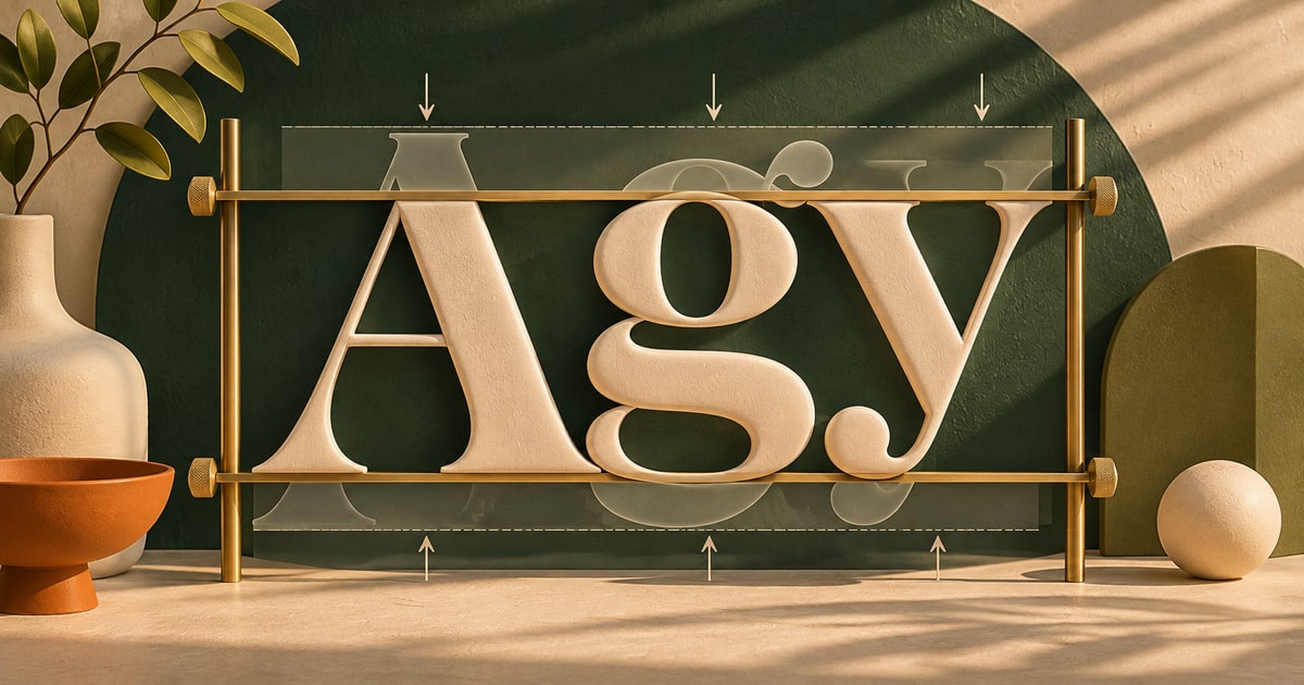
There is a specific kind of spacing issue that shows up in almost every design system.
You align text inside a container—maybe a card, maybe a button—and something feels slightly off. The text looks like it has extra space above or below it, even though your margins and padding are technically correct.
So you tweak things. Adjust line-height. Nudge padding. Add small offsets until it “looks right.”
text-margin-trim is designed to remove that guesswork. It lets the browser trim the extra space around text so alignment actually matches what you see.
Why text never quite lines up
When you work with text in CSS, you are not just dealing with the visible letters. You are dealing with the font’s metrics—ascenders, descenders, and built-in spacing that affects how text sits inside its box.
That is why text often appears to have extra space above the first line or below the last line, even when everything is technically aligned.
This becomes especially noticeable in tighter layouts—buttons, badges, cards—where visual balance matters more than raw measurements.
And because that spacing comes from the font itself, it is not something you can reliably “fix” with margin or padding alone.
What text-margin-trim actually does
text-margin-trim lets the browser remove the extra space at the start and end of text blocks—based on the font’s metrics.
Instead of adjusting the container, it adjusts how the text itself is measured.
That means the visual edges of the text align more closely with the edges of its container.
.label {
  text-margin-trim: block;
}
In this case, the browser trims the space above the first line and below the last line, making the text sit more cleanly within its box.
You are not changing the text—you are changing how its boundaries are interpreted.
The mental model (what is actually happening)
It helps to think of text as having invisible padding built into it.
That padding is not something you declared—it comes from the font and how line boxes are calculated.
text-margin-trim gives you a way to trim that invisible space so the text behaves more like a visually tight element.
text-margin-trim: block;This trims the top and bottom edges. In some cases, you may also want more granular control depending on the layout.
The key idea: you are aligning what you see, not just what the browser calculates.
Where this starts to matter
Tighter buttons and labels
Buttons are one of the most obvious places this shows up. Even when padding is balanced, the text can feel slightly off-center.
.button {
  padding: 0.5em 1em;
  text-margin-trim: block;
}
The result feels more visually centered without needing to tweak values by eye.
Cards and UI components
In cards or panels, headings and body text often introduce small inconsistencies in vertical rhythm.
Trimming the text edges helps everything align more cleanly within the component.
.card-title {
  text-margin-trim: block;
}
Subtle change, but it removes that “slightly off” feeling.
Consistent vertical rhythm
When multiple text elements stack together, their built-in spacing can compound in ways that are hard to predict.
Trimming those edges makes spacing more consistent and easier to control.
Block vs inline trimming
Most use cases focus on trimming in the block direction (top and bottom), but the property is designed to work with different writing modes as well.
That means the trimming adapts based on how text flows, not just traditional horizontal layouts.
In practice, you will most often reach for:
text-margin-trim: block;It handles the most common alignment issues without overcomplicating things.
What to watch for
This property changes how text is visually measured, which means it can affect layouts that depend on precise spacing.
It is also font-dependent. Different fonts have different metrics, so the impact may vary slightly depending on what you are using.
And because this is a newer feature, support is still evolving. It is something to use thoughtfully, especially in production environments.
Use
text-margin-trim when text feels misaligned—even though your spacing values are correct.
Can you use this today?
This is still an emerging feature, so support is limited compared to more established CSS properties.
That makes it a good candidate for progressive enhancement rather than a core dependency.
You can apply it where supported and rely on standard spacing elsewhere without breaking layouts.
Quick answers
Is this the same as adjusting line-height?
Not quite. Line-height affects spacing between lines, while text-margin-trim affects the outer edges of the text block.
Does this replace margin or padding?
No—it complements them. It handles the space that margin and padding cannot reach.
When should I use it?
When text looks slightly misaligned, even though your layout values are correct.
Want to go deeper?
As CSS continues to expose more of the underlying behavior of text and layout, features like this help bridge the gap between technical accuracy and visual intent.
Text has always carried a bit of invisible baggage. This is one of the first tools that lets you clean it up directly.